Color Confidence: How to Choose Shades That Flatter You
10/25/20255 min read
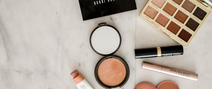
Understanding Skin Undertones
Choosing the right colors that flatter your skin can significantly enhance your overall appearance and boost your confidence. A key aspect of this process involves understanding your skin's undertone. There are three primary undertones: warm, cool, and neutral. Each undertone responds differently to various colors, making it essential to identify which category you fall into.
Warm undertones typically feature hues of yellow, peach, or golden. Individuals with this undertone tend to look best in earth tones, such as olive, orange, yellow, and warm reds. A simple way to determine your undertone is to examine the veins on your wrist. If the veins appear green, you likely have warm undertones.
In contrast, cool undertones have hints of pink, red, or blue. Those with this undertone usually shine in colors like jewel tones, silver, and vibrant blues. An effective method to recognize your cool undertones is by checking how gold and silver jewelry complements your skin. If silver enhances your complexion more than gold, you likely belong to the cool undertone category.
Lastly, neutral undertones are a mix of both warm and cool tones, often characterized by a balance of colors. Individuals with neutral undertones find that they can wear a wider range of shades without appearing washed out or overly saturated. This flexibility allows them to experiment with diverse palettes, from taupe to berry shades.
By accurately identifying your undertone, you can make more informed decisions about the color shades that will enhance your natural beauty. This understanding can lead to improved choices in clothing, makeup, and accessories, ultimately fostering a greater sense of color confidence.
Exploring Seasonal Color Palettes
The concept of seasonal color palettes has gained popularity in the realm of personal style and fashion. This classification categorizes colors into four groups that align with the characteristics of each season: Winter, Spring, Summer, and Autumn. By understanding these palettes, individuals can make informed decisions about their wardrobe choices, ensuring that the colors they wear complement their skin tone and enhance their overall appearance.
Starting with the Winter palette, this category is characterized by bold, vibrant colors and cool undertones. Those who fall into the Winter category often look best in jewel tones such as deep blues, emerald greens, and rich purples. Bright hues like fuchsia and icy shades of white also thrive in this palette, creating striking contrasts against the skin. Colors within this range typically evoke a sense of drama and sophistication.
Next is the Spring palette, which embodies freshness and warmth. These individuals usually shine in soft pastels and lively, warm tones. Ideal colors include coral, turquoise, and light green, alongside sun-kissed yellows and bright pinks. The Spring palette evokes a cheerful vibe, making it a wonderful choice for those who align with these hues.
For those whose features are complemented by the Summer palette, the emphasis is on cool, soft colors. Muted tones such as lavender, soft pink, and powder blue define this season. The colors often have gray undertones, contributing to a more understated elegance. These shades can create a serene aesthetic that resonates with individuals who gravitate towards this seasonal classification.
Lastly, the Autumn palette is synonymous with earthy, warm tones. Individuals characterized by this season often find that colors such as olive green, burnt orange, and mustard yellow are particularly flattering. Rich browns and deep reds also make appearances, reflecting the natural warmth of autumn leaves. By understanding and identifying with these seasonal palettes, individuals can curate a wardrobe that truly reflects their personality while enhancing their unique features.
Pairing Colors for Balance and Harmony
Understanding how to pair colors effectively is essential for achieving a balanced and harmonious look in any outfit. One key concept in color theory is the use of complementary colors, which are those found opposite each other on the color wheel. For instance, pairing blue with orange or red with green can create striking juxtapositions that draw attention yet maintain visual appeal. When using complementary colors, it is vital to balance the proportions; for example, one can opt for a predominantly blue outfit accented with orange accessories to ensure that the bold contrasts do not overwhelm the overall look.
Another approach involves utilizing analogous colors, which are colors located next to each other on the color wheel, such as blue, blue-green, and green. This method often results in a more subdued and harmonious appearance, making it an excellent choice for both casual and formal settings. To successfully employ analogous colors, consider selecting one primary color and incorporating its neighbors as accents in your attire. For example, wearing a teal dress with soft green shoes and a blue handbag can create a visually appealing ensemble without clashing.
Incorporating trends while maintaining cohesion is also crucial. Awareness of seasonal palettes, for instance, can significantly enhance your wardrobe choices. While bold colors may dominate a given season, mixing them with neutral shades can provide balance. For example, pairing a vibrant fuchsia top with classic black trousers allows the bright hue to pop without creating a chaotic visual effect. Ultimately, the key to mastering the art of color pairing lies in practice and experimentation. Don’t hesitate to play with different combinations to discover what resonates with your personal style while enhancing your confidence through thoughtfully chosen shades.
Expressing Your Personality Through Color
Colors have an intrinsic ability to communicate emotions and aspects of one's personality. Each hue in the spectrum can evoke specific feelings and responses, making color an essential tool for self-expression. For instance, vibrant shades like red or yellow exude confidence and energy, often attracting attention and projecting a bold persona. In contrast, softer tones such as pastels or earth shades can create a calming presence, suggesting a more reserved or introspective character. Understanding how different colors resonate can empower individuals to convey desired messages effectively through their appearance.
When selecting shades that resonate with your identity, consider the emotions associated with the colors you are drawn to. Reflect on the image you wish to portray and the feelings you want to evoke in others. By aligning your color choices with your personality traits, you can enhance your public image. For example, if you are looking to display creativity and positivity, wearing brighter shades may amplify that perception. Conversely, if your goal is to appear more grounded and dependable, opting for muted or classic colors could be more appropriate.
Experimenting with different color combinations is also an exciting way to discover unique expressions of self. Mixing and matching colors can create intriguing contrasts that reflect your style while remaining true to your essence. To start, consider creating a color palette based on your favorite hues and their meanings. You can then explore how these colors can be integrated into your wardrobe, accessories, or even home decor. This approach allows for personal exploration and ensures that the final choices encapsulate your individuality in a visually striking way.
In conclusion, using color as a means of self-expression opens the door to showcasing your personality. By understanding the emotional impact of colors and experimenting with various shades, you can create meaningful visual statements that resonate with your identity and bring your personality to the forefront.